The museum says it asked 500 Londoners and tourists to share their thoughts on the logo in focus groups, workshops and surveys.
The Museum of London in the UK capital has had a rebrand - and its new logo has raised eyebrows.
The institution, whose exhibits tell the stories of the lives of Londoners, has been renamed London Museum.
It will open in new premises in Smithfield Market in 2026 after long delays and exceeding its budget.
London Museum’s new logo makes a splat
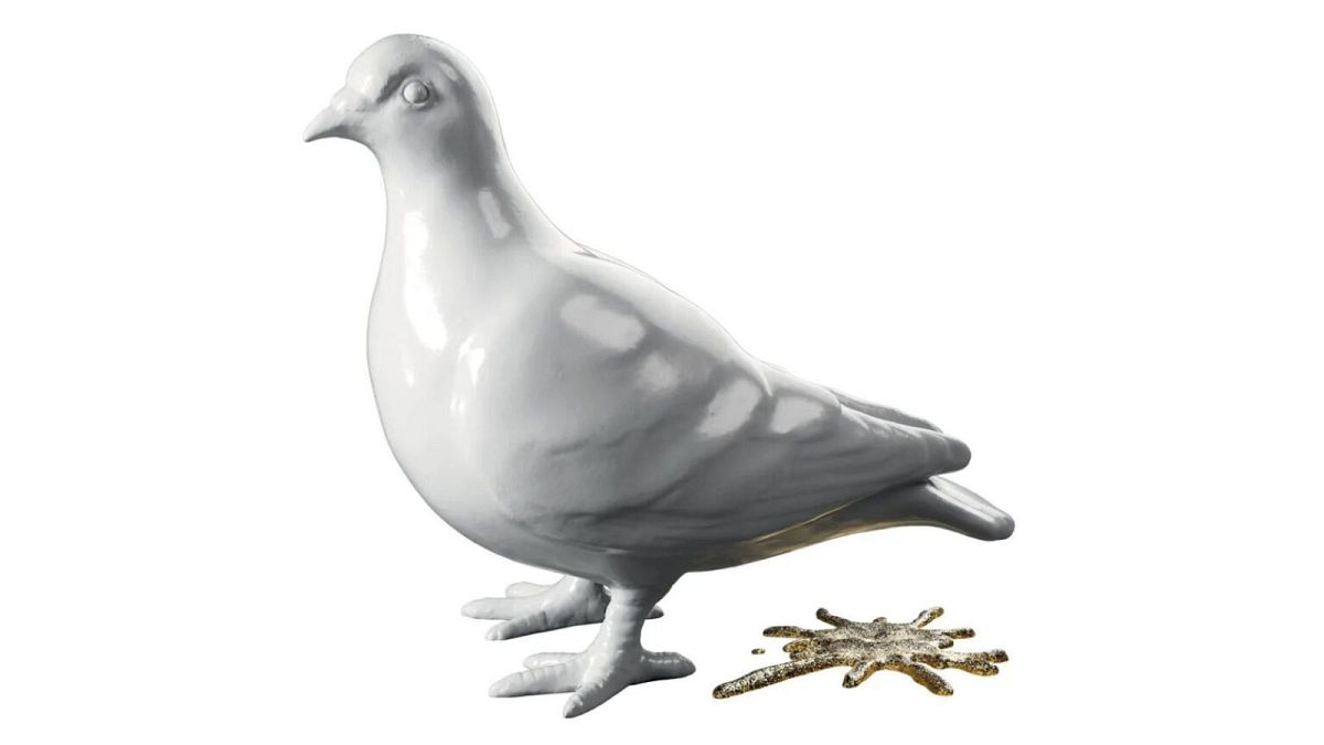
London Museum’s new logo is a clay statue of a white pigeon who has just done a glittery golden poop.
According to director Sharon Ament, “The pigeon and splat speak to a historic place full of dualities,” with the logo representing the capital’s age-old blend of “grit and glitter.”
In a blog post, senior curator Francis Marshall writes: “For over 1,000 years these birds have watched London change and grow - becoming a symbol of the city in the process.”
But some Londoners are not convinced.
“I’ve lived here 15 years and I can tell you no one ever thinks, feels or speaks about pigeons,” says Maxwell Blowfield, creator and writer of museum industry email newsletter maxwell museums.
“They’re also one of the least unique things about London. Paris 2024 has been flogging pigeon badges for their Olympics. What were the rejected logo ideas? Clouds, moss, oxygen, Deliveroo bikes, Tuesdays?”
How did London Museum come up with its new logo?
London Museum’s rebrand is all about “making sure the museum continues to be engaging and relevant and to inspire people with stories about one of the world’s great capital cities.”
Apparently, the museum asked 500 Londoners and tourists to share their thoughts in focus groups, workshops and surveys.
“Londoners told us they wanted the museum to address big issues, be grounded in the realities of London life, and put on entertaining, thought-provoking programming,” the museum says.
“Our old logo was unpopular, representing neither our identity nor aspirations.”
They entrusted Uncommon Creative Studio with designing a new logo. The studio recruited 33 Londoners, from the 32 boroughs and the City, who have made their mark on London.
The group included tattoo artists, DJs, chefs, children’s TV producers, boxers and museum conservators.
"A good logo gets people talking. Our pigeon, cast from London clay, and its splat, rendered in glitter, prompts people to reconsider London,” says Ament.
“The pigeon and splat speak to [...] a place where the grit and the glitter have existed side by side for millennia. We share our city with others, including millions of animals. Pigeons are all over London and so are we.”
Even with an elaborate backstory, the logo is prompting scepticism.
“It feels a bit like reasoning had to be retrospectively applied to a focus group decision,” says Blowfield.
“London is a remarkable place. Yet the London Museum has managed to avoid representing anything remarkable about it in this rebrand. Which is in itself remarkable.”


